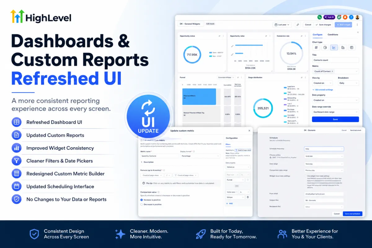
HighLevel Dashboards and Custom Reports UI Consistency Update
HighLevel Dashboards and Custom Reports Get a Refreshed UI for a More Consistent Experience
HighLevel has released a refreshed UI experience for Dashboards and Custom Reports, focused on making reporting pages feel cleaner, more polished, and more consistent across the platform.
This update improves the look and feel of dashboard builders, custom reports, widgets, filters, modals, schedule pages, and custom metric tools. The goal is not to change how reporting works, but to make the experience visually smoother and easier to navigate.
For agencies and businesses that use dashboards to track performance, this update helps create a more unified reporting environment with fewer visual inconsistencies between pages.
Quick Summary: What’s New?
This update focuses on visual consistency across HighLevel’s reporting tools.
Here’s what has improved:
Refreshed Dashboard UI
Updated Custom Reports layout
Improved widget consistency
Cleaner filters and date pickers
Redesigned Custom Metric Builder
Updated scheduling interface
More consistent side panels, modals, and navigation
No changes to existing reports, dashboards, widgets, or data
This is mainly a UI consistency update, but it can make everyday reporting tasks feel much smoother.
Before vs. After: What Changed?
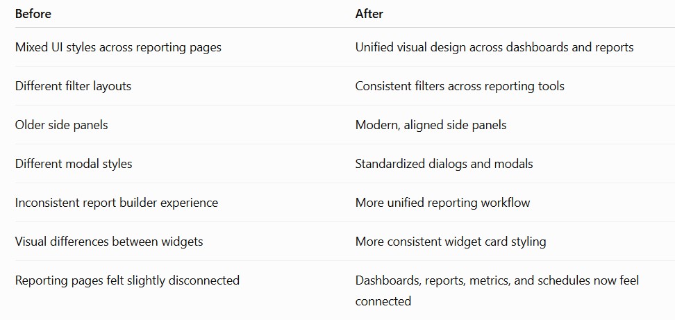
This makes the reporting experience easier to understand, especially for users who move between dashboards, custom reports, filters, and scheduling tools often.
What’s New in the Dashboard and Custom Reports UI?
HighLevel has updated several reporting areas to follow a more consistent visual system.
The refreshed experience includes improvements across dashboards, custom reports, chart widgets, side panels, filters, modals, schedules, and custom metric builders.
This means users will notice a cleaner interface when moving between reporting tools, instead of seeing different layouts or styling patterns from one section to another.
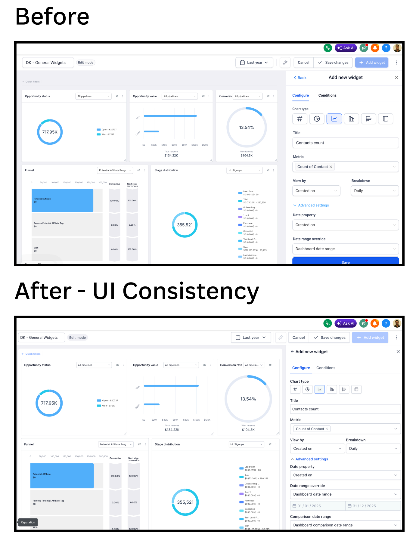
Dashboards Now Feel More Polished
One of the biggest improvements is the refreshed dashboard experience.
The dashboard header, navigation, breadcrumbs, side panels, and modals now feel more visually aligned. This creates a smoother experience when building, editing, or reviewing dashboards.
Every major chart and widget type has also been updated with more consistent styling, including:
Numeric widgets
Bar charts
Donut charts
Line charts
Tables
Funnel charts
Other reporting widgets
The result is a cleaner, more modern dashboard experience that makes navigating reports and interpreting data feel more intuitive.
Custom Reports Have a More Unified Layout
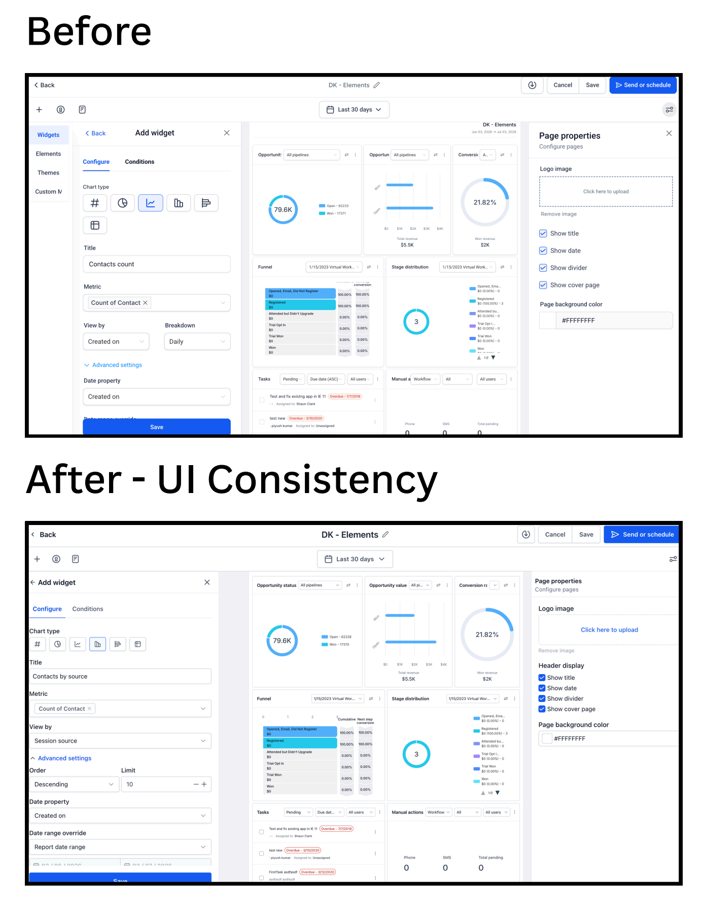
Custom Reports also received visual alignment improvements.
The report builder, report list, schedule page, and clone or duplicate flows now follow a more consistent layout from start to finish. This helps users move through reporting tasks with less confusion.
Instead of different reporting screens feeling slightly disconnected, the refreshed UI makes the overall experience feel more connected and predictable.
Filters, Date Pickers, and Advanced Settings Are More Consistent
Advanced filters, quick filter panels, and date pickers now follow the same visual language across dashboards and reports.
This is a useful improvement because reporting tools often involve many controls, dropdowns, filters, and date settings. When these elements look and behave consistently, the experience becomes easier to understand.
For users managing multiple reports or dashboards, this can reduce visual friction and make everyday reporting tasks feel smoother.
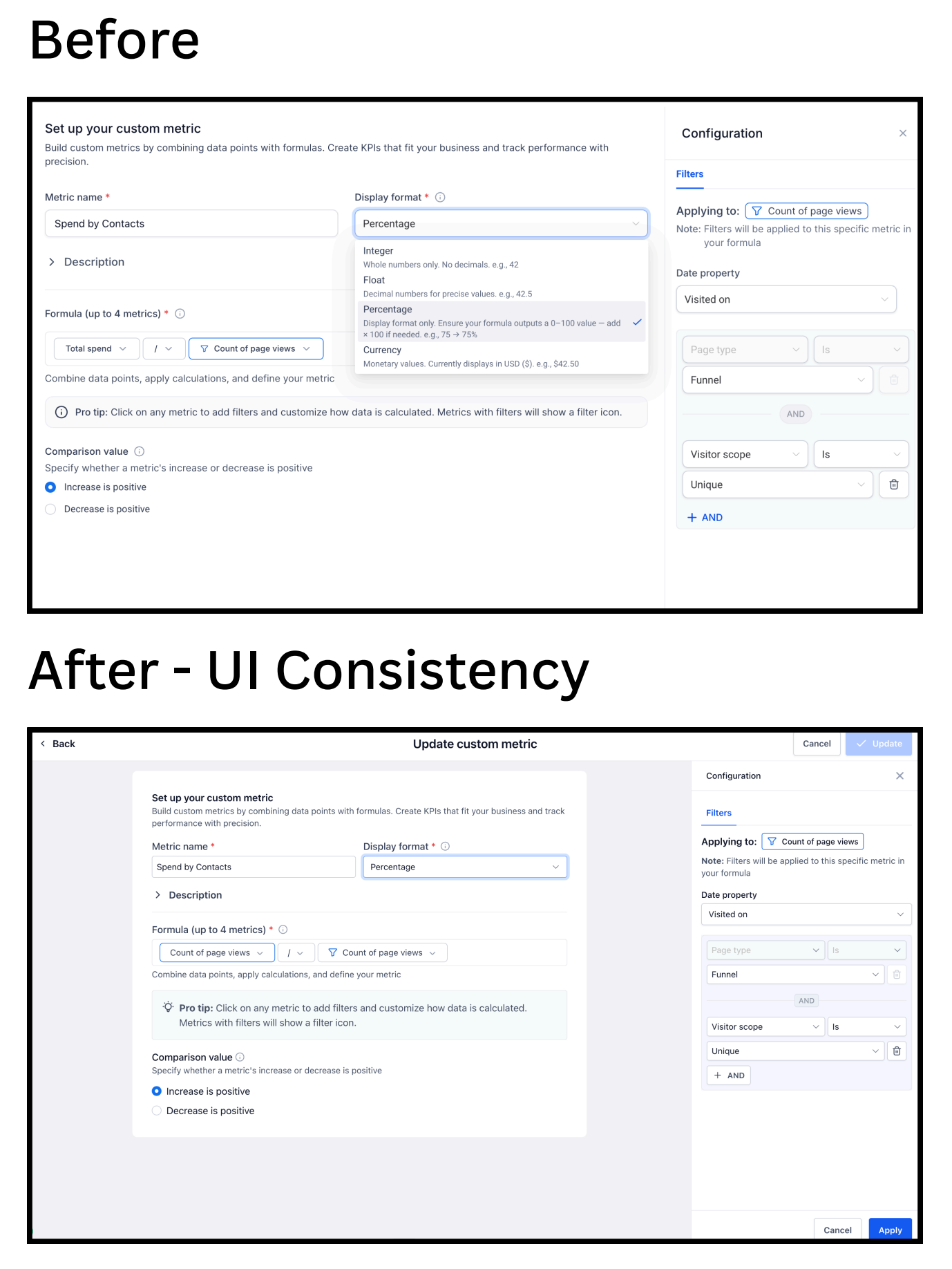
Custom Metric Builder Gets a Cleaner Layout
The Custom Metric Builder has also been updated with a cleaner and more consistent interface.
This includes the formula builder and filter panel, which now feel more aligned with the rest of the reporting experience.
Users can still build custom metrics by combining data points and formulas, but the updated layout makes the process feel more structured and easier to follow.
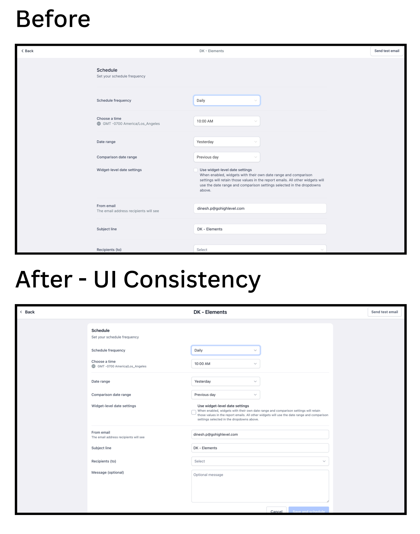
Report Scheduling Looks Cleaner Too
The report scheduling page has also been refreshed.
The updated layout makes schedule frequency, date range, comparison date range, email sender, subject line, recipients, and message fields feel more organized.
This is helpful for users who regularly send reports to clients, teams, or stakeholders.
Who Will Benefit Most from This Update?
This update is especially useful for teams that spend a lot of time inside dashboards and reports.
It can help:
Marketing agencies
SaaS businesses
Reporting-heavy teams
Client success managers
Business owners reviewing KPIs
Teams are creating custom reports daily
Agencies managing reports across multiple client accounts
For agencies, the biggest benefit is consistency. When every reporting screen follows the same visual structure, it becomes easier to train team members, review performance, and prepare client reports.
Practical Workflow Example
Imagine you are preparing monthly reports for 40 clients.
Before this update, you may have moved between dashboards, custom reports, scheduling pages, filters, and custom metrics that each looked slightly different. Even if the functionality worked, the visual differences could make the process feel less smooth.
With this refreshed UI, every reporting screen now follows the same design language.
That means less time adjusting to different layouts, fewer visual surprises, and a more predictable workflow when building or reviewing reports.
For agencies managing reporting at scale, that kind of consistency can make everyday work feel much more efficient.
What Didn’t Change?
This update does not change your reporting data or existing setup.
HighLevel notes that this is a UI consistency update only. Your existing dashboards, reports, widgets, filters, and custom metrics remain exactly as they were.
This update does not change:
Dashboard data
Existing reports
Custom metrics
Widgets
Report calculations
Scheduled reports
Existing reporting workflows
Only the visual interface has been refreshed.
How to Enable the Refreshed Reporting Experience
To try the refreshed experience, go to:
Settings → Labs
Then enable:
Dashboard and custom reporting – UI consistency update
Since the update is currently available through Labs, agencies can test the refreshed interface before it becomes part of the standard experience. This allows teams to become familiar with the new layout while continuing to use their existing reports and dashboards.
Once enabled, the updated UI will load automatically when opening Dashboards or Custom Reports.
Why UI Consistency Matters
Reporting is one of the most frequently used areas inside HighLevel. Even small interface improvements can make everyday tasks faster, reduce visual clutter, and create a more consistent experience for agencies managing multiple clients.
While this update does not introduce new reporting features, it lays the foundation for future enhancements. A consistent design system allows HighLevel to roll out new reporting capabilities more smoothly while reducing the learning curve for users.
Agencies that spend hours inside dashboards each week will likely notice the smoother experience immediately.
Important Notes
This update may affect users who have added custom CSS styling to their dashboards.
Because the UI components have been refreshed, some custom styling may need to be reviewed or adjusted. Minor spacing differences may also appear in some areas, which is expected as part of the component alignment.
HighLevel also encourages users to use the feedback button if they notice anything that looks off.
FAQ
Will my dashboards change?
No. Your existing dashboards remain unchanged. The update only refreshes the visual interface.
Will my reports break?
No. Existing reports, data, widgets, and calculations continue working normally.
Do I need to rebuild my widgets?
No. Existing widgets remain in place and continue working as before.
Is this enabled automatically?
Currently, the refreshed experience must be enabled from Settings → Labs.
Does this affect white-label dashboards?
Only visually. Existing functionality and data remain unchanged.
Does this update add new reporting features?
No. This update focuses on UI consistency, not new reporting functionality.
Final Thoughts
The refreshed UI for HighLevel Dashboards and Custom Reports is a practical improvement for users who rely on reporting every day.
By aligning headers, side panels, filters, widgets, modals, schedule pages, and custom metric tools, HighLevel has made the reporting experience feel more polished and consistent.
For agencies and businesses managing performance reports, this update makes dashboards and custom reports easier to navigate, cleaner to review, and more visually reliable.
Even though no data or functionality has changed, the improved consistency can make a noticeable difference for teams that work inside HighLevel reporting tools every day.


